

Kubernetes
Cost Management
Monitor costs at the cluster, node, and workload level.


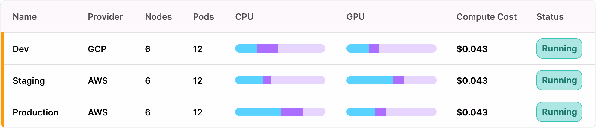
Multi-cluster/multi-cloud monitoring
Track costs across AWS, GCP, Azure, and on-prem Kubernetes from a single dashboard. DevZero consolidates spend data across environments, giving you a clear, unified view - no more switching consoles or manual billing work.
Resource Utilization
DevZero shows the gap between what you provision, request, and actually use, making waste visible. Most clusters run at just 10–20% utilization. Know your numbers. Take action.
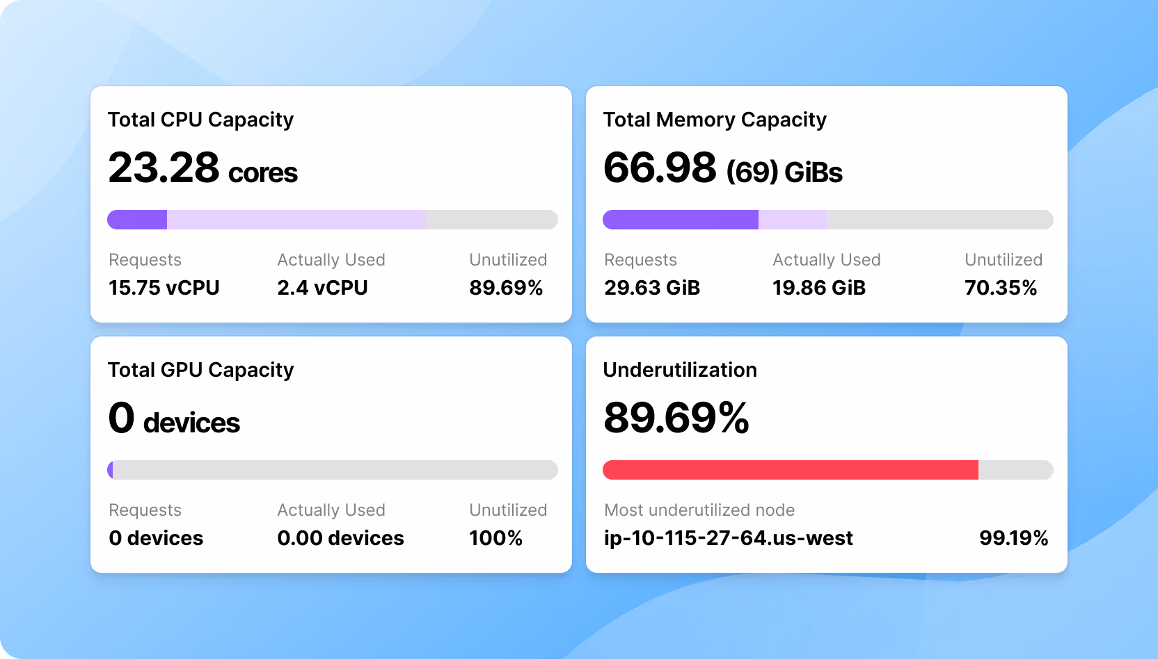
Monitor usage, spot overprovisioning, track trends, and get alerts.
See real vs. allocated usage, spot inefficiencies, and avoid OOM issues.
Monitor workload usage, find idle GPUs, and compare job efficiency.
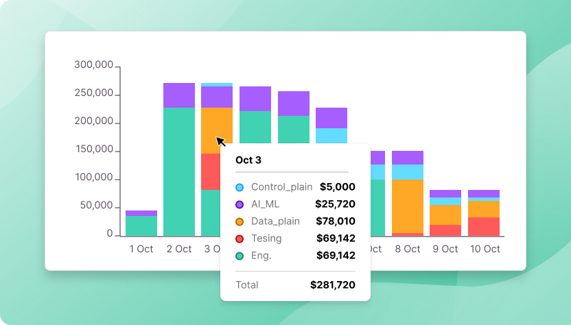
Workload-level costs
Get detailed cost breakdowns by deployment, workload, or custom group. Track spend by namespace or label. Identify resource-heavy services and optimize with data.

Department level cost
Create allocation groups that mirror your organizational structure and track costs by team, product, or environment. Tag once and DevZero automatically manages shared, multi-tenant clusters to ensure accurate cost attribution.
Kubernetes
Cost - Free Assessment
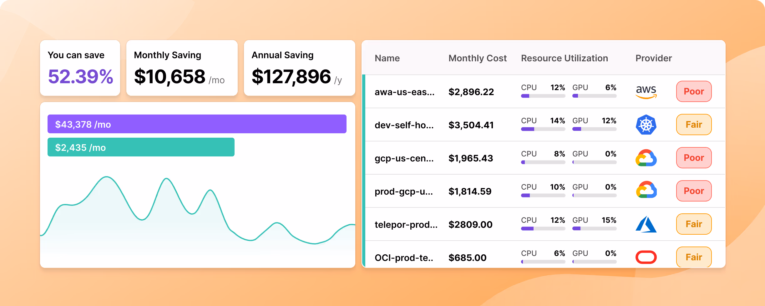
Get a free self-serve cost assessment of your cluster. Cost per node-group and workload. Find which workloads are more expensive and wasteful and how much you can save.
Frequently asked questions
DevZero installs in under 30 seconds with a single command. Our lightweight operator immediately begins collecting telemetry data from your cluster, giving you instant visibility into resource usage and optimization opportunities. No complex configuration or infrastructure changes are required.
DevZero is a Kubernetes cost optimization platform that uses AI-driven automation to reduce cloud spending by 40-70%. It continuously rightsizes workloads, optimizes nodes, and intelligently selects instance types, all without requiring any changes to your applications or restarting your services.
DevZero supports Amazon Elastic Kubernetes Service (EKS), Google Kubernetes Engine (GKE), Azure Kubernetes Service (AKS), Oracle’s cloud platform (OCI), as well as on-prem Kubernetes implementations.
AWS Cost Explorer, Azure Cost Management, and GCP's billing tools show node level costs. DevZero shows Kubernetes native costs by pod, deployment, namespace, and workload. You get the granularity needed for containerized environments.
DevZero complements rather than replaces autoscalers like Karpenter and Cluster Autoscaler. While those tools focus on node-level scaling, DevZero operates at three levels: cluster, node, and individual workload optimization. Many DevZero customers actually use DevZero alongside Karpenter or KEDA. Our casse studies show an 80% reduction in cost even for customers using these autoscalers.
DevZero operators only gather resource utilization data, specifically compute, memory and network, as well as workload names and type. We do not have access to logs or application specific data. Moreover, our cost monitoring operator is read-only.
Absolutely. DevZero is specifically designed to handle GPU-intensive workloads, ensuring even your most demanding AI jobs stay live, adaptive, and continuously available through live migration technology. Unlike basic autoscalers, DevZero provides specialized optimization for GPU workloads including intelligent scheduling, utilization monitoring, and can achieve 40-70% cost reduction specifically for GPU infrastructure. The platform dynamically adjusts GPU allocations based on actual usage patterns, preventing the common problem of provisioning 8-12 GPUs when actual utilization is less than one GPU.